Branding
Oollo Tea
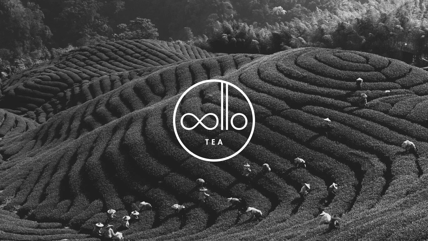
Crafting tea is an art, and art requires a canvas. The brand concept is to provide natural and quality teas with a blank canvas. By using neutral colours and clean typefaces, the brand acts as a supporting unifier to the galore of whole leaf, direct traded teas. No whistles nor bells, the emphasize is strictly on the tea.
The name “Oollo” is formed from the “ool” in oolong tea, and “lo” from the founder’s family name. It is dated that the Lo Family has been crafting tea since almost a century ago in the year 1923. The brand is created by the great granddaughter of the Lo Family, continuing the legacy oversea in Vancouver, Canada.
The sound “oollo” in Haka can be rawly translated to “not old”, or “to not age”. The meaning connotes the idea of longevity in life, and is represented by the infinity sign replacing the first two Os of “Oollo” in the logo.
Product photography and styling courtesy of Flattened To Fit Paper (flattenedtofitpaper.com).


