Branding
Mondivan
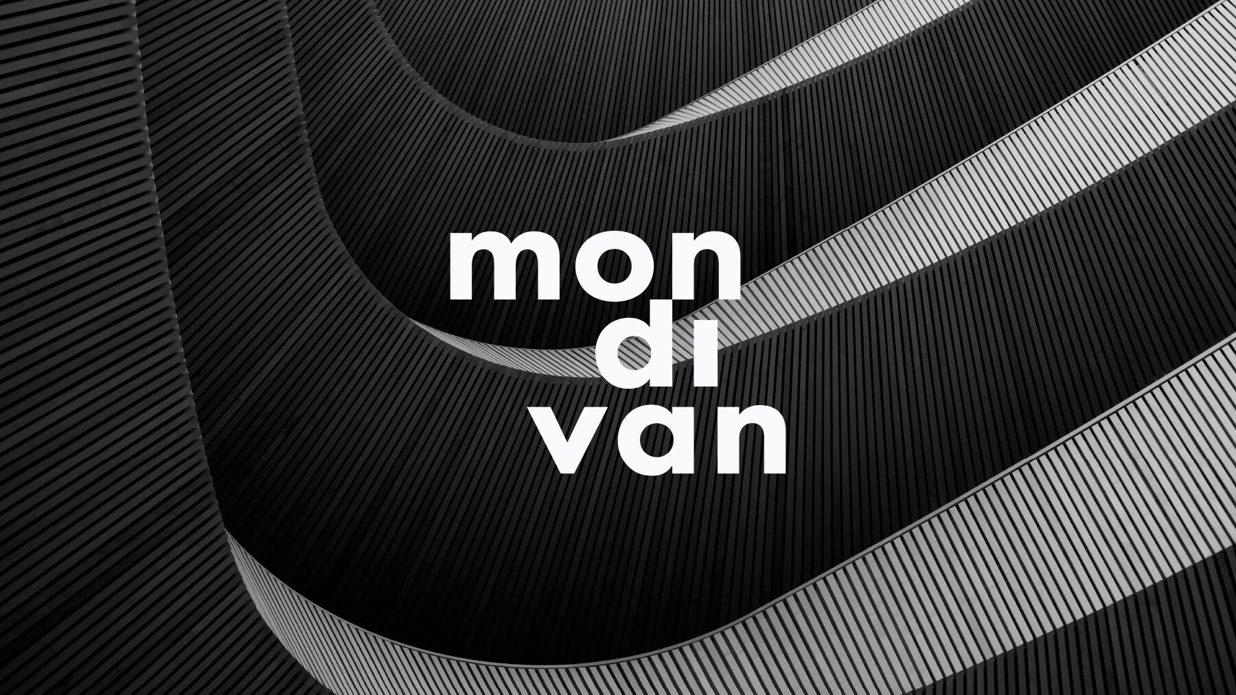
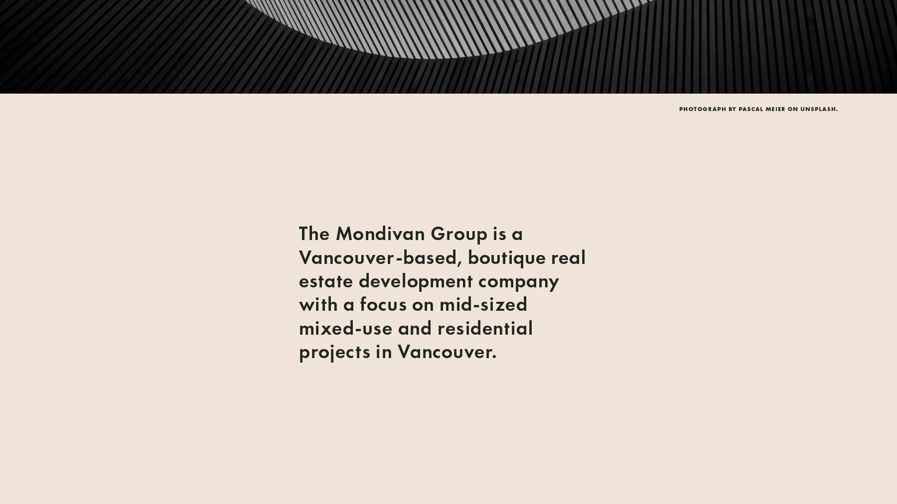
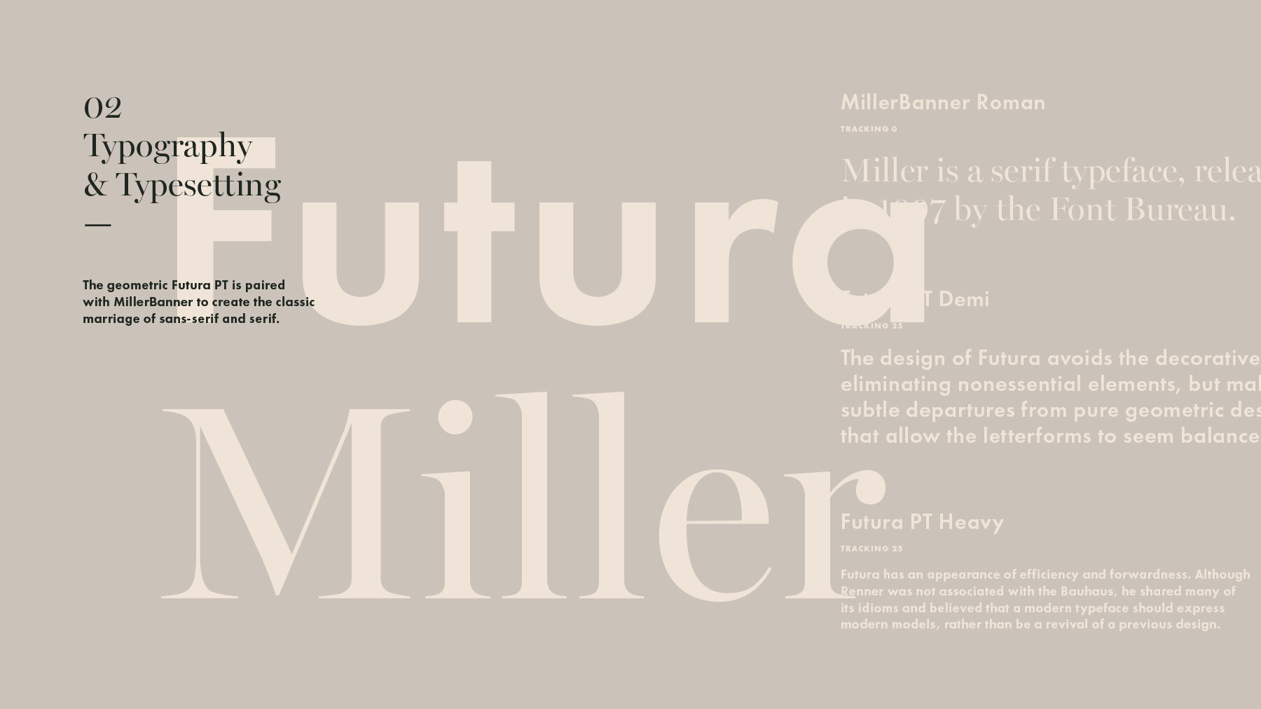
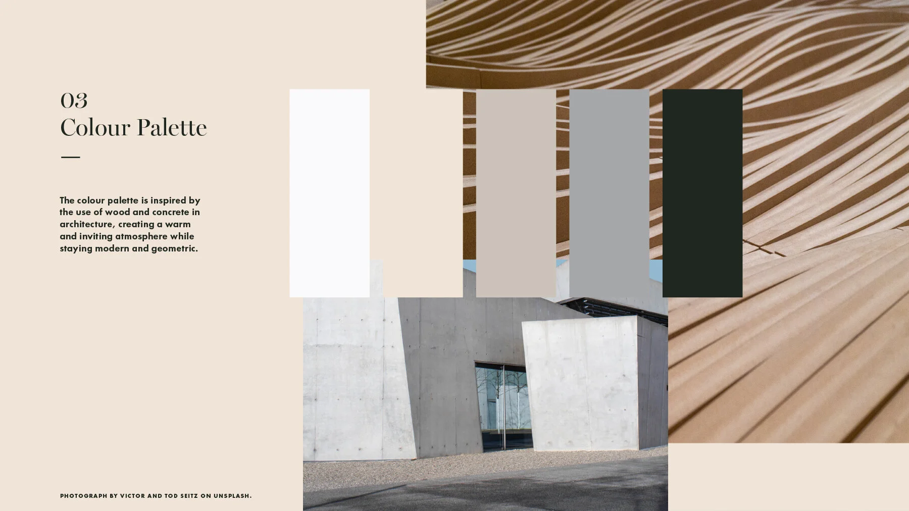
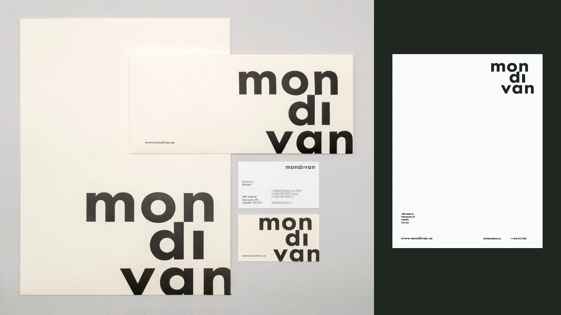
Mondivan is a young real estate development company located in Vancouver. The client wanted to rebrand the business to express the values of design, professionalism and comfort. The logotype is created from lower-cased letters and a staggered type treatment, connoting a playful and whimsical vibe while staying professional. The logotype format is preferred to better aid in recognition, which a young brand may lack. The geometric Futura PT is paired with MillerBanner to evoke the classic marriage of sans-serif and serif. The combination shows sophistication and modernity. The colour palette is inspired by the use of wood and concrete in architecture, creating a warm and inviting atmosphere while staying modern and geometric.