Branding Proposal
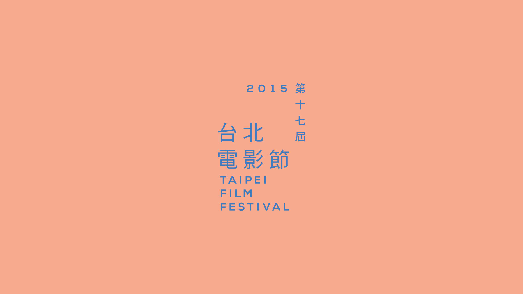
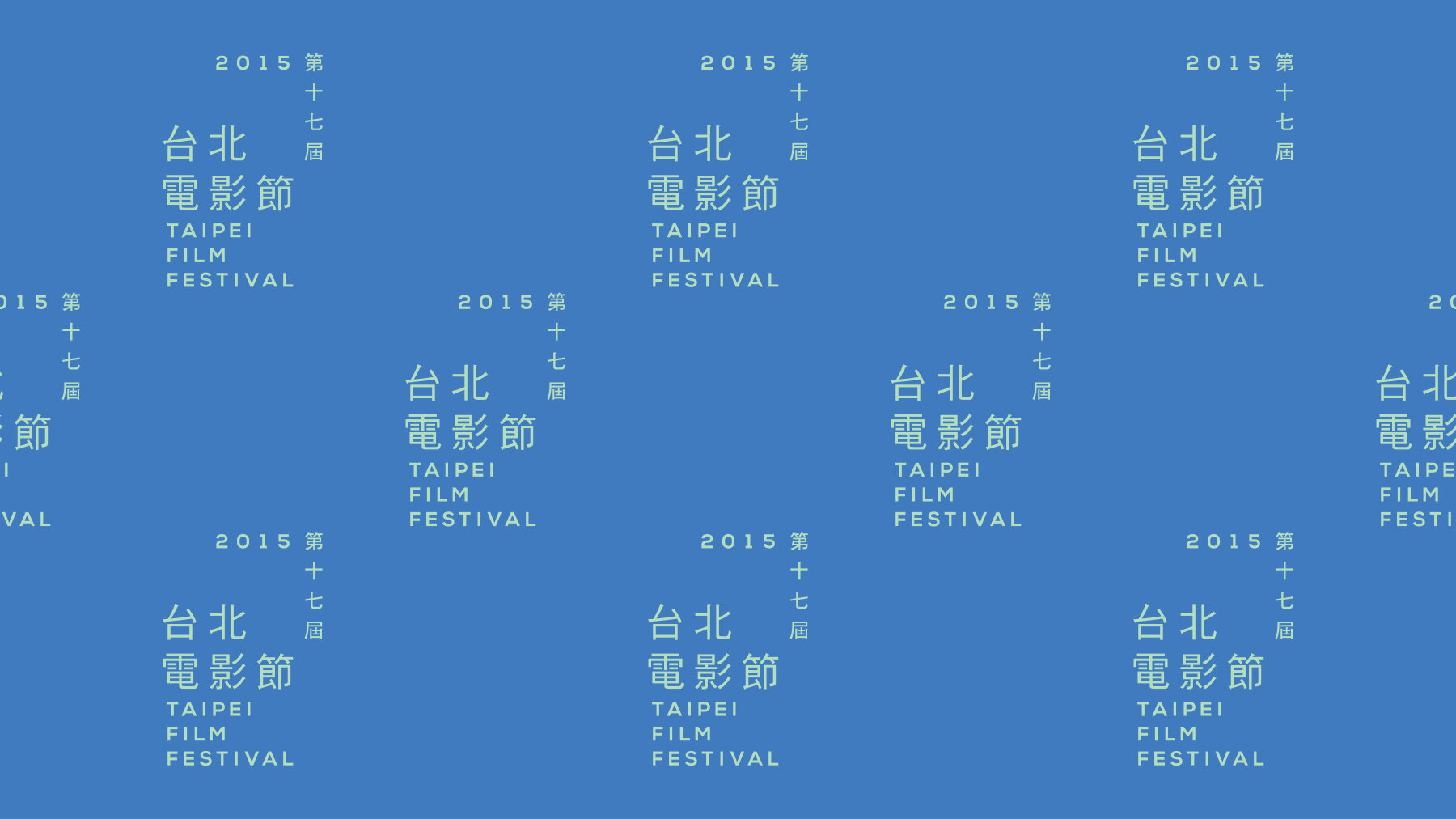
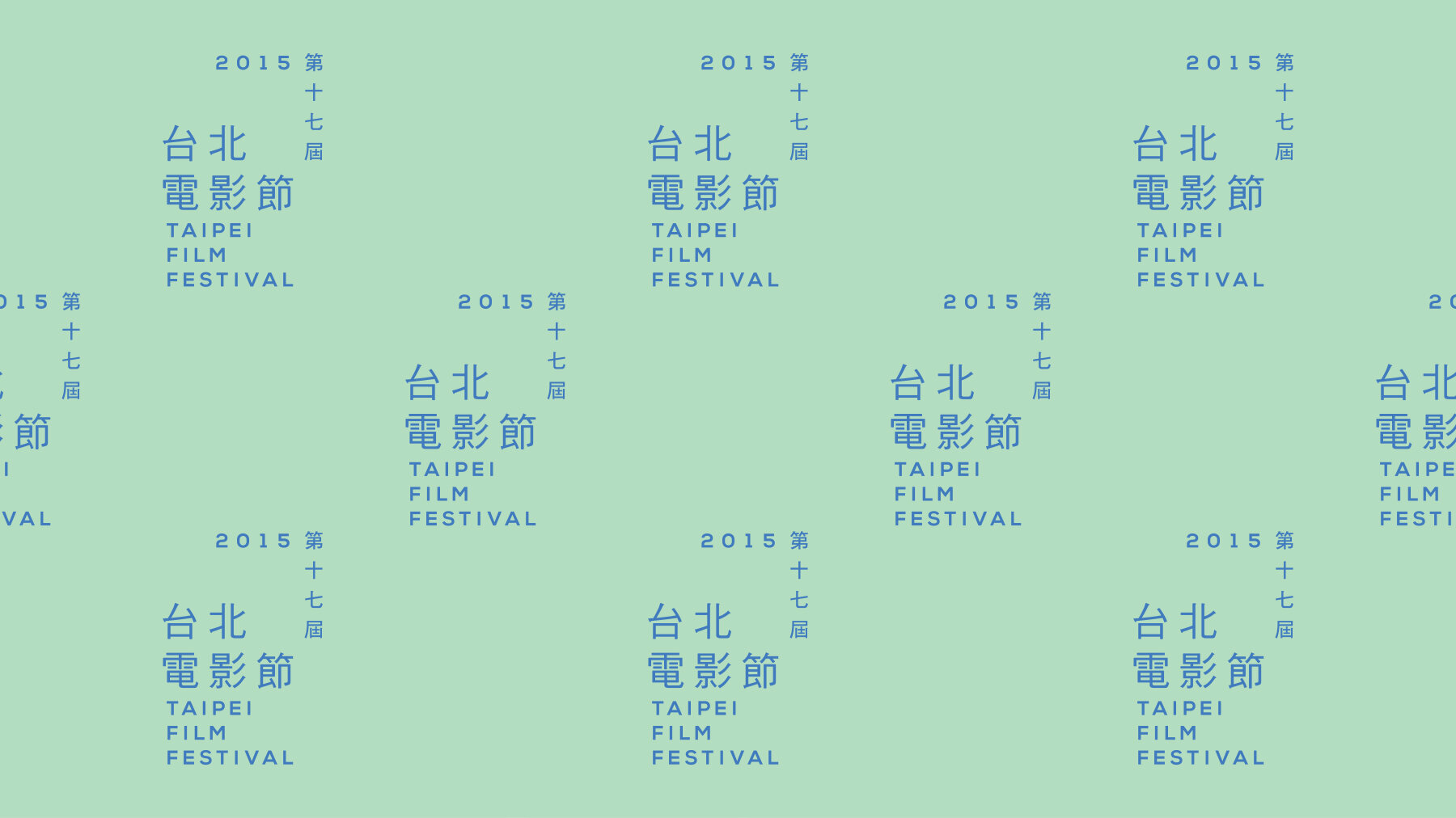
Taipei Film Festival 2015
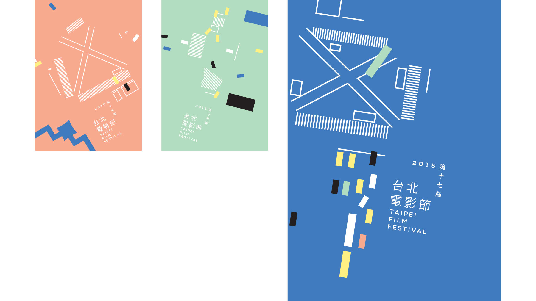
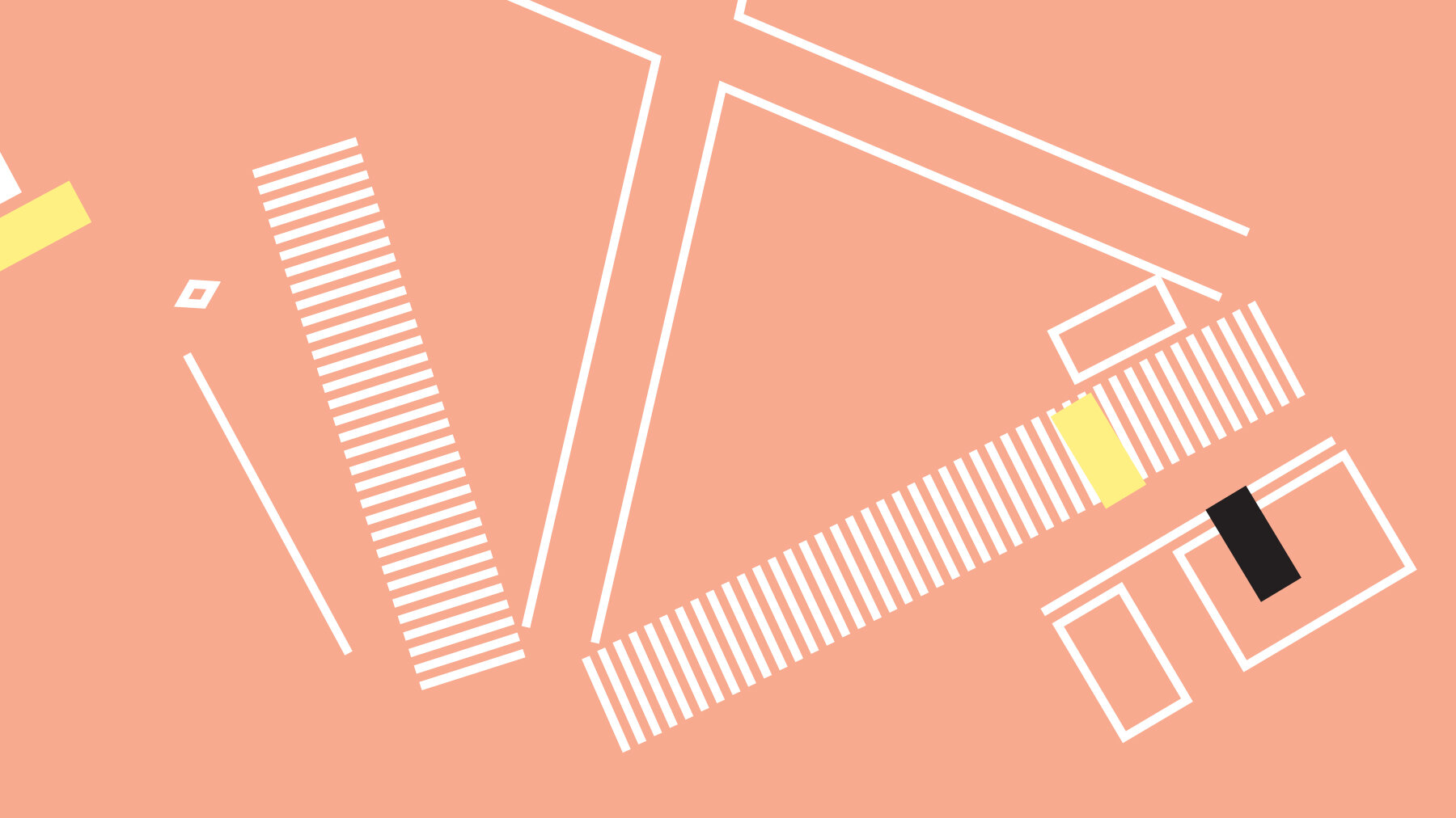
This year the theme is focused around adventure and discovery, and the word that comes to mind is perspective. Having a different perspective is having a visual adventure, the view is unfamiliar, and that's when a discovery is possible. With the help of technology, I made my discovery looking from the universe down.
I am a minimalist when it comes to design; I love to play with simple lines and shapes. With these basic graphic elements, I discovered how a city could be simplified. This series of topographic illustrations are drawn from intersections in Taipei as seen through Google Satellite. The logo itself is designed to interact with the lines in the illustrations as the layout of the text speaks in directions. The san serif and Hei typefaces echo the feeling of modernity and minimalism and pair well with the illustrative style. The colour scheme is a reflection of Taiwan: yellow for the taxis, mint for the buses, blue for the roofs of Chiang Kai-shek Memorial Hall and peach for the ambiance of neon and street lights at night.